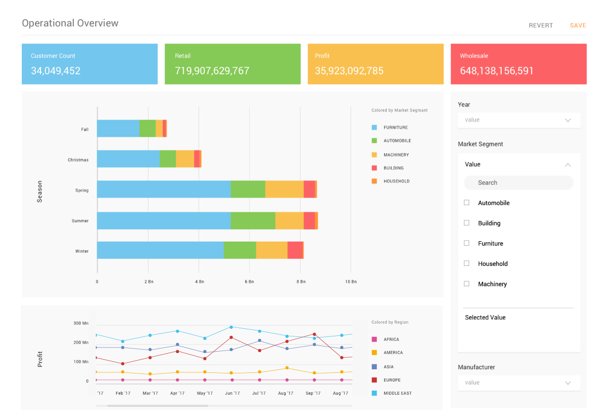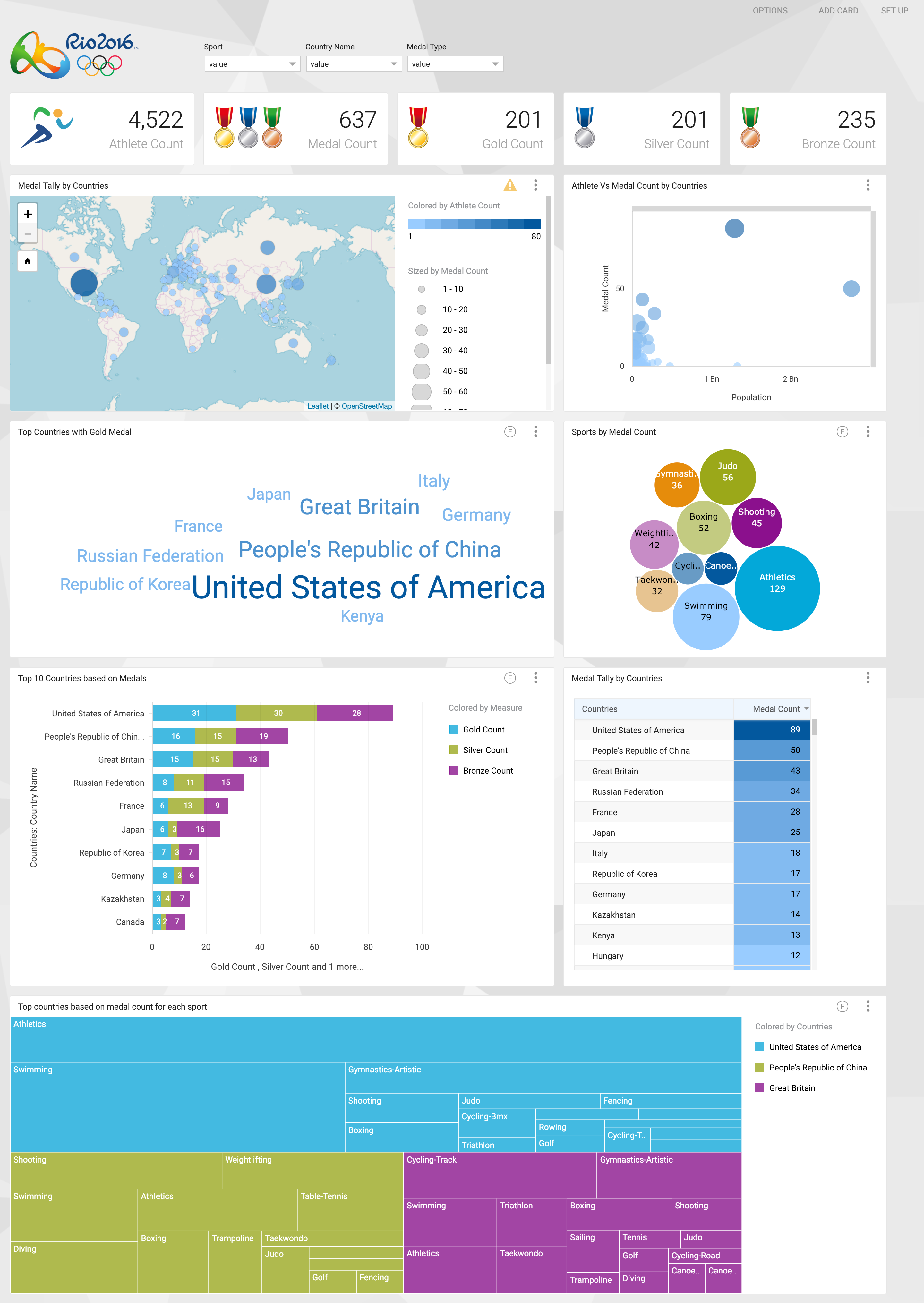
Data visualization is the process of using graphical and visual elements to represent a variety of data appropriately so that the business users can understand all their data effortlessly. It is a well-known fact that humans process visual data better than any other form of data. In fact, 93% of all human communication is visual, and the human brain can process images 60,000 times faster than text. This means that visual data is interpreted more effectively and improves our decision-making power. And, visualizations become more significant if data volumes are massive as co-relating information can be quite tedious.
Visualizations on massive data and its transformational abilities
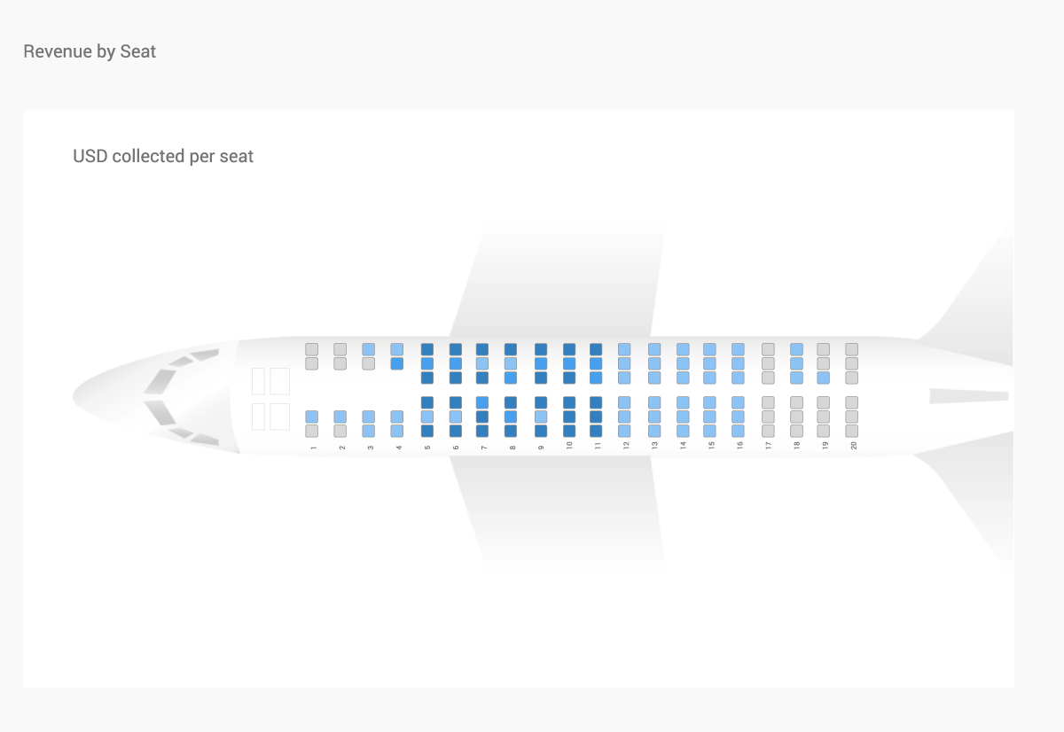
Mapping data the way human mind works can create real transformational value for a business. Let’s look at some interesting cases from the work that Kyvos has done for its customers. In one of the projects for a major airline, Kyvos developed custom visualization to help their business users conduct more effective flight seat analysis.

As shown in the picture above, seat booking data from millions of transactions for hundreds of daily flights across the globe is represented in a visualization shaped like an airplane. The seats that generate more revenue appear darker in the visualization, helping the airline identify profitable seats that could be charged higher and the poorly occupied ones that need promotions.
This visualization is interactive and can be analyzed across several parameters such as geography, seasons, different equipment types and more, to get deeper insights into their customer’s preferences. It is very helpful as business users can instantly relate to the visualization, without the need to interpret actual numbers. They can use the insights to align their pricing models and promotion strategies.
Another interesting example comes from a major car manufacturer who wanted to create an appropriate visualization to understand the impact of automobile wheel balancing on insurance costs.
In this case, the visualization is designed to look like a car where the amount of imbalance for each tire is represented by the degree to which the tire is angled. The visualization maps millions of rows of historical data from service reports and insurance costs, and business users can slice and dice, and filter data on several dimensions to analyze it interactively. This extremely interesting way of representing data helps them conduct instant comparisons against threshold lines and make business decisions such as assessing the value of future insurance premiums.
These are just a few examples, but they show how organizations use innovative visualizations to simplify analytics on massive data for their business users.
Tips for creating effective Visualizations on Massive Data
Creating useful visualizations on all your data is as important as the process of collecting and storing massive volumes of data. Follow these tips to create visualizations that will help your business users make better and faster decisions.
- Choose visualizations to match your data
Ensure that the right visualization is chosen for the right type of data. For example, line charts should be used for analysis conducted over long periods, bar charts work better for comparing unrelated categorical values, pie-charts are appropriate to depict whole-part relationships, and so on. In some cases, it makes sense to invest time and money to create custom visualizations that relate to your line of business. - Build interactive visualizations
Visualizations should support ad-hoc analysis of massive data. Users should be able to filter, slice and dice, drill up and down, and interact with their visualization so that they get instant answers to their questions and can ask further questions based on those answers. - Connect them all
Enable end-to-end analysis of all your data. Make sure that different visualizations on your dashboard are connected and can be instantly linked so that users can connect the dots and understand the complete picture. - Don’t ignore the speed factor
Always consider performance while designing visualizations. This can be taken care of by creating and starting with the most important data and then provide options to load more. You can do this by choosing the right set of filters for slicing or dicing your data so that performance is optimized and dashboards are refreshed instantly. Performance of your visualization is one of the most critical parameters that determine the success of your BI initiatives. - Collaboration features
The effectiveness of visualization increases if it can be easily shared with others in the organization. Users should be able to capture their analysis in visual form so that others can see the same picture that they saw. This enables better collaboration and often speeds up the decision-making process.

Kyvos Visualizations
Kyvos is a BI acceleration platform that makes your visualizations perform on massive data. One of the most common problems with visualizations is that they slow down when the size of the data increases. Kyvos solves this problem by forming a BI acceleration layer between your existing tools and your data on the cloud or on-premise platforms, helping your visualizations refresh instantly irrespective of the size of data.
Kyvos also offers its own native visualization layer that provides an intuitive drag-and-drop interface for self-service analysis on massive data. It allows easy exploration and analysis of data with an extensive library of charts including bar, line, GIS, heat map, treemap, and other advanced visualizations. It also has an auto-visualization feature that enables the system to automatically choose the correct visualization based on the type of data that is being loaded.
Whether you are using a custom visualization tool or your favorite business intelligence tools such as Tableau, MicroStrategy, Excel, or others, Kyvos helps you work on massive data with high performance and instant response times.
To learn more on how you can make better-informed business decisions with effective visualizations on all your data, download our solution brief or request a demo now.
